
Terri, at Second Wind Leisure Perspective, has invited us to ‘think pink’ this month. My mind immediately goes to Pink Panther, Barbie, the recording artist Pink, Pepto Bismol, and the universal symbol of Breast Cancer awareness. For various reasons, mostly childhood trauma (Barbie and Pepto Bismol), I am not going to talk about any of those today.
I shared my thoughts on pink in a previous post, and if you read that one, you already know that it isn’t my favorite color. I haven’t delved deeply into the psychology of my disdain, and I don’t completely object to it, just not as a wardrobe choice, unless it is worn as an accent piece, or by other people. Head-to-toe pink makes me cringe. So, I’m left with a love/hate relationship with the color because I absolutely love it in architecture and nature.
We often choose sun-drenched travel destinations. Bright colors (especially pink), sunshine, blue skies, and water complement each other in a way that symbolizes welcome and hospitality. I find the color refreshing and inviting when used in architecture. In the photos below, the freshly painted doors, pink tiles covering the entire building, and especially the worn, faded doors sing out to me.


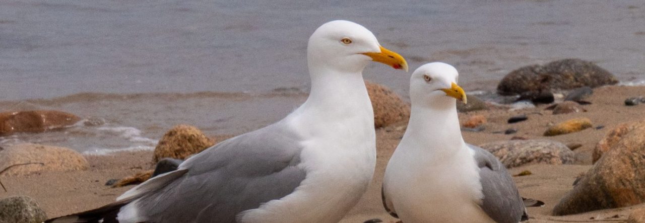
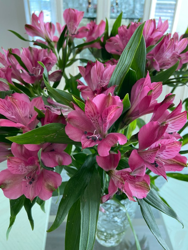
Encountering pink in nature always makes me smile…


Malcolm looks great in pink. Me, not so much… I like the pink raincoat that I travel with. It makes it easier for him to find me in a crowd 🙂 Who doesn’t love celebrating with pink champagne?


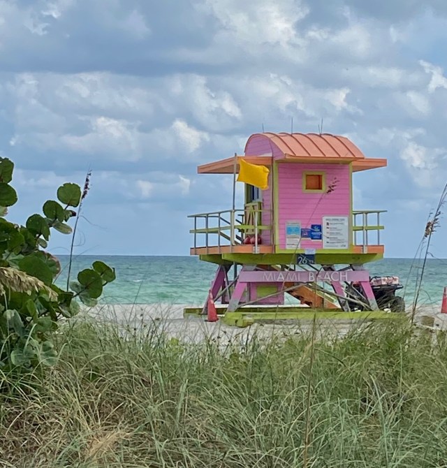
Miami Beach is well-known for its brightly colored lifeguard stations. This is one of my favorites.
Pink has its place in the world, but it will be next to never when I embrace it as a clothing choice. What are your thoughts about pink? Love it, hate it, somewhere in between?
Linking With

I love your pink architecture and garden choices, but it’s not a color I gravitate towards in clothing although I do like your pink raincoat. 🙂
LikeLike
Judy, it’s hard to get lost in that pink raincoat. Malcolm bought it for me years ago because it packs well. There were no other color choices. I own a baby pink sweater, but other than that, there are no pink clothes in my closet. Have a great week.
LikeLiked by 1 person
I haven’t really thought about pink much. My favorite color is yellow. But, I have to agree with you – I love pink in nature. I think it could be just the right accent in architecture. I do love the combination of pink and green.
LikeLike
Betty, my favorite color is blue, both in nature and in my wardrobe. I don’t wear much yellow, but I love it in the garden. The combination of pink and green makes me think of Lily Pulitzer’s signature fabric. I tried to be a Lily girl, but I just can’t do it, too girly.
LikeLiked by 1 person
Loved all the pink pics Suzanne. Pink is my favourite colour (right up there with purple) so it was a pleasure scrolling through all those lovely images. Thanks for brightening up my evening. 🙂
LikeLike
You are welcome. I can see you as a ‘pink lady.’ It suits your sweetness.
LikeLike
All great examples of pink – my fave being the Roseate Spoonbill. We have those where we winter in south Texas too. Although I don’t have much solid pink in my wardrobe, I do love the colour, but then again, I love all colours.
LikeLike
Terry, any shade of beige or blue, balanced with black and white, and I’m good to go. Color just isn’t my thing, except in nature. Some people do color beautifully, but I’m not one of them.
LikeLiked by 1 person
I hear you there, Suzanne. In clothing, I have to watch for the correct shades of red, yellow, green, and orange or my skin takes on a tallow appearance. I also love blues, blacks, whites, browns, and tans … so yes, almost any colour as long as I pay attention to the hues.
LikeLiked by 1 person
I love your examples of faded pinks in architecture! I have a similar love/hate relationship with the colour, but more in terms of the different shades. I’m not a fan of pastel pinks but deeper shades appeal more and suit me better I believe, so I do wear them. And in nature I love pink blossom as it heralds the spring, but by the time the roses appear I’m more drawn to yellow or white 😀
LikeLike
Sarah, I could probably pull off a dusty rose, but I’m with you on the pastel pink. Not a color for grown women…
LikeLiked by 1 person
I love your photographs highlighting pink! I love pink both in clothes and everything else. I also love blue and turquoise. If you opened my closet, those are the colors you would find. 🙂 Splashes of pink in nature are always amazing. (Your husband looks very good in pink, and pink champagne is wonderful!)
LikeLike
Linda, thank you. I’ll tell Malcolm you said so. He looks good in almost any color and wears everything from baby pink to emerald green. I just look silly in pink and even worse in anything with a print. My go-to colors are black, white, beige, and blue in any shade.
LikeLike
Pink does look great in architecture and nature! When I was a kid and teenager, I hated pink as I felt it was related to girls and girlie stuff, which I wasn’t into. No, I never owned a Barbie doll. 🙂
As an adult, I grew to like it better and I have a couple of t-shirts in that color, but I prefer shades of blue and purple as favorite colors.
LikeLike
Liesbet, my cousin had Barbie dolls and always wanted me to play ‘dress up’ with her. I think I was traumatized by all that pink and developed a visceral reaction to anything overly ‘girly.’ My pink raincoat is the boldest article of clothing I own 🙂 but it serves a purpose, so I’ll keep it.
LikeLiked by 1 person
The pink door is interesting. I like its weathered texture. Whenever I think of pink of think of the movie, Mean Girls: “On Wednesday we wear pink.”
LikeLike
Ally, I love the weathered door. The zip tie is a bit of a mystery, but other than that, it has character. It is kinda funny that girl gangs always wear pink. I guess it’s an intimidating color, or maybe it just takes a lot of confidence to wear it.
LikeLiked by 1 person
Architectural pink is always stunning as your pics show, Suzanne! And of course nature’s. Being a redhead (albeit fading fast), pink and red were verboten for me to wear. But I did love my Barbies and their pink stuff, LOL!
I’m obsessed with that pink lifeguard stand! I noticed you sporting a pink rain slicker–it looks good!–and your highlights of pink drinks are perfect. Thanks for sharing for Sunday Stills this week!
LikeLike
Terri, I love that lifeguard station. There are lots of others, in every color in the rainbow. You’d love them. My mom is a redhead too. Maybe that explains a few things. Hmmm…
LikeLiked by 1 person
😁
LikeLiked by 1 person
That’s a great collection. I love the life guard station.
LikeLike
Thanks, Dan. Those lifeguard stands are iconic in Miami. One day I will take the time to photograph them all.
LikeLiked by 1 person
My instant thoughts of pink would have very little correlation with yours. Instant reactions would be Pink Floyd, carnations, pigs, cherry blossom, and probably the Pink Panther as our only crossover. I don’t think I possess any pink clothing, though Michaela does and I think she looks good in it.
LikeLike
I have never seen a pink pig, although I know they are something of a tourist attraction in the islands. I’ve never seen a cherry blossom, except in pictures, yes to Pink Floyd, and carnations, all acceptable representations of pink. I am sure Michaela looks beautiful in pink with her blond hair and light skin. Me, complete opposite. Thanks for stopping by and have a wonderful week.
LikeLiked by 1 person
I love that pink light house. Otherwise I prefer the primary colors. I think you see more pastel colors in warmer, sunnier climates because other colors fade so badly!
LikeLike
Jan, I think you are right about that. It’s probably the same reason there are so many white roofs.
LikeLike
Lately I’ve turned into a bit of a Pink fan myself after not loling it so much as a kid. And you’re right it does suit some people’s complexions more than others.
lovely shots. The cherry blossoms(?) are especially lovely.
LikeLike
No, not cherry blossoms, although after photographing the tree several times, I still don’t know its name. Interesting that you have transitioned into a pink fan.
LikeLike
Hi Suzanne, I should have joined in this week as my favourite colour is Pink! It can be vibrant and also relaxing depending on the hue. Your photos as always look impressive and I particularly like the photos of the doors and the colourful Life Guard station. Have a lovely week. Sue L xx
LikeLike
Sue, you wear bold colors beautifully. I’m not surprised that you love pink. Glad you like the photos. I always enjoy Terri’s color challenges.
LikeLiked by 1 person
Wonderful pinks especially from a non-pink person 😀 The pink weathered door and the lifeguard station are my favourites.
LikeLike
Welcome. I’m glad you enjoyed my photographs. The weathered door is my favorite, but I love the whimsy of the lifeguard station. Pinks have their place, just not on my body!!! Unless it’s to send an SOS signal (raincoat). Thanks for stopping by and have a wonderful week.
LikeLiked by 1 person
Enjoy your week as well
LikeLike
Hi, Suzanne – Your pink captures are all stunning — especially those doors. Absolutely gorgeous!
LikeLike
Donna, I’m glad you liked the doors. Those were from our recent trip. I love doors, especially weathered ones, and am always on the lookout for something unique to submit to Dan’s Thursday Doors challenge. I got lucky and double-dipped with Terri’s color challenge this week. Have a great week.
LikeLiked by 1 person
I love that weathered pink door! I avoided pink when I was young because I didn’t consider myself a girly-girl. I still don’t wear it often as an adult but I just noticed that I’m wearing a pink top in my avatar 🙂 . Smart to wear the pink raincoat… it would stand out in a crowd!
LikeLike
When I’m not wearing the raincoat, he attaches a leash. I have a way of wandering…:-)
Nah, I didn’t do the girly-girl thing well as a child. I have tried as an adult, but it doesn’t suit me. I prefer jeans and a T-shirt (any color but pink).
I’m glad the weathered door caught your eye.
LikeLike
I like pink T-shirts with black or grey trousers.
But generally, I don’t like pink.
In the history of writing about colours, it was seen as a weak or sick red. At the time of Madame Pompadour, during Rococo, pink was the most liked colour. Today, it’s one of the five most disliked colours in Central Europe.
The Fab Four of Cley
🙂 🙂 🙂 🙂
LikeLike
Interesting points about pink. Thank you. In the US (and the tennis world in general), if you reference the Fab Four of Clay, you mean Nadal, Jokovic, Federer, and Murray. 🙂 But I have a feeling it means something entirely different to you. I will pop over to your blog and solve the mystery. Thanks for visiting.
LikeLiked by 1 person
I wrote several books about colours, in which I followed up the history of how colour was used in different ages and why. I base my colour theory on the gesture and the physiological impact of colours.
You find my books on my website http://www.kbvollmar.de and on amazon and in bookshops of 25 countries.
Thank you very much for your comment
Klausbernd 🙂
LikeLiked by 1 person
Oh wow. I love all of these. So stunning.
LikeLike
What a great collection of pinks Suzanne. I love that lifeguard station on the beach, it’s fabulous!!
LikeLike
The lifeguard station seems to be a crowd favorite. It perfectly reflects Miami Beach’s ‘whimsy’.Thanks for stopping by.
LikeLike
Suzanne, What a beautiful collection of pinks. I like that weathered door and the life guard station. When I was in Miami, I walked along the beach and took pictures of the lifeguard stations.
LikeLiked by 1 person
Natalie, I’m not surprised. It’s definitely something you’d be interested in.
LikeLike
Suzanne,
Splendid collection of pinks. I love to wear pink shirts be cause it goes well with white hair (LOL)! I also enjoy pink on street art. I have attached a pink sidewalk piano we spotted once in Corsicana, TX. Kinda neat, don’t you think? Have a great week! Joe
LikeLike
Great piano. I would love to know the story about the paint!
LikeLiked by 1 person
I’m not sure about the paint, but the city of Corsicana put these old pianos on every block of this small downtown. Most were out of tune or unplayable, but it made for in interesting touch.
LikeLiked by 1 person
Love your pink pics! I don’t wear much myself but lately my MIL has been wearing it a lot! It’s cheery in grey winter days like we’re having right now. Thanks for brightening my day!! 💗💗
LikeLiked by 1 person